3S Money Design System title card on a dark teal background with a geometric line pattern
Colour token swatches for four colour families, each scaled from 50 to 900 with usage labels.A colour contrast specimen with AAA accessibility ratings, above two colour-scale bars.A UI mockup showing spacing tokens applied, beside a spacing token table with scaled examples.Typography documentation: typeface samples, a token definitions table, and a type-scale table.
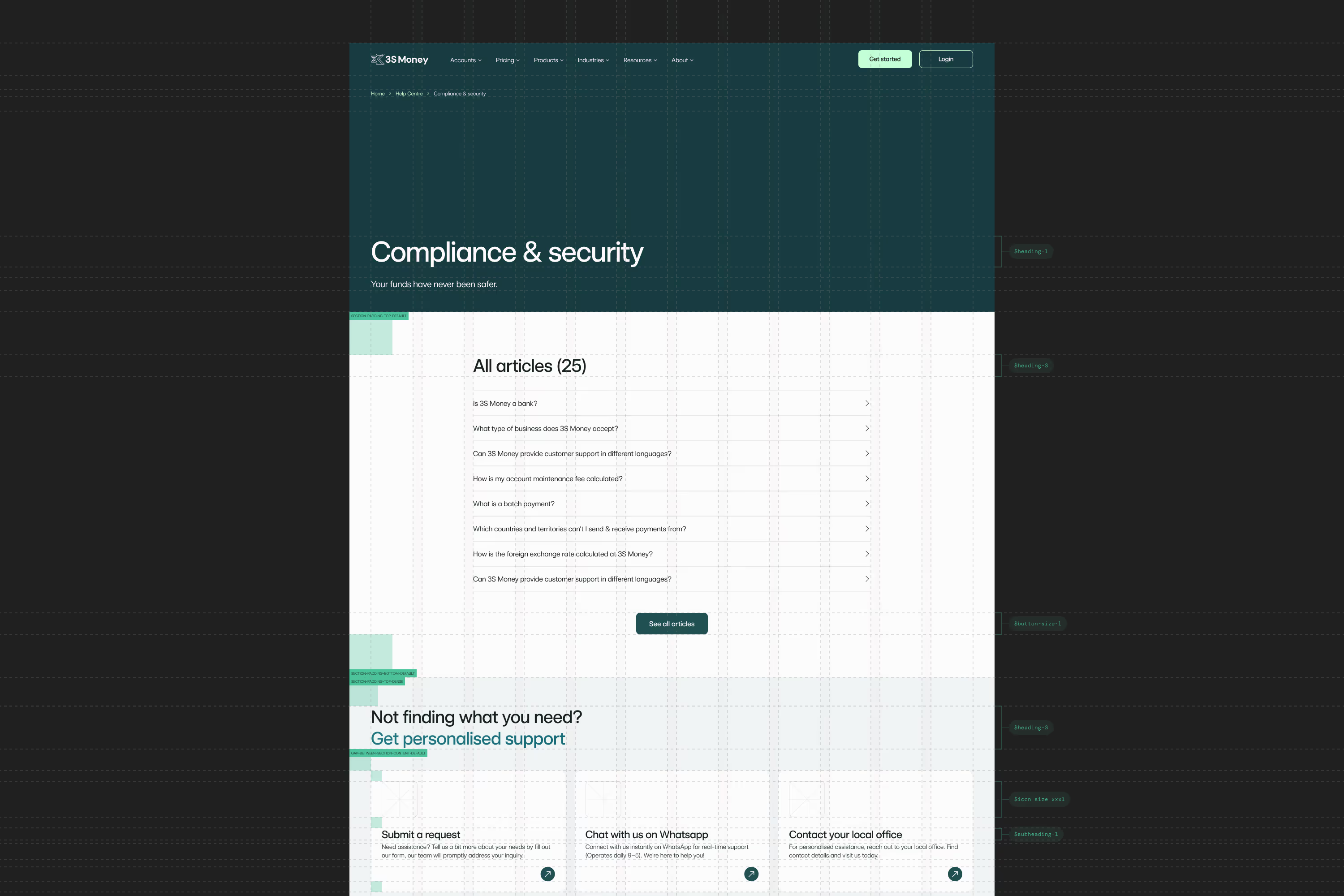
A screenshot of the live compliance and security help page, shown as an example of the tokens in use.
An icon-size scale on a grid, a baseline grid diagram, and a customer testimonial quote card.Two screenshots of the website footer, shown as an example of the layout grid in use.A border-radius token table and guides, with a button, dropdown, toggle and play button at different corner radii.A mobile CTA mockup and button-state grid, beside the component's property panel.
Summary
3S Money's product and marketing teams were working with separate libraries and inconsistent design foundations. I co-led the company's first design system with the lead designer and was its main design contributor, working with designers and frontend developers. The work established a shared visual language, tokens, and components, then developed through trials and a second major iteration. Reusable templates and designs for CMS components extended the system into everyday content creation as well as product and website design. It was adopted by the product and marketing teams and an external agency.